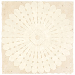
Details — Click to read
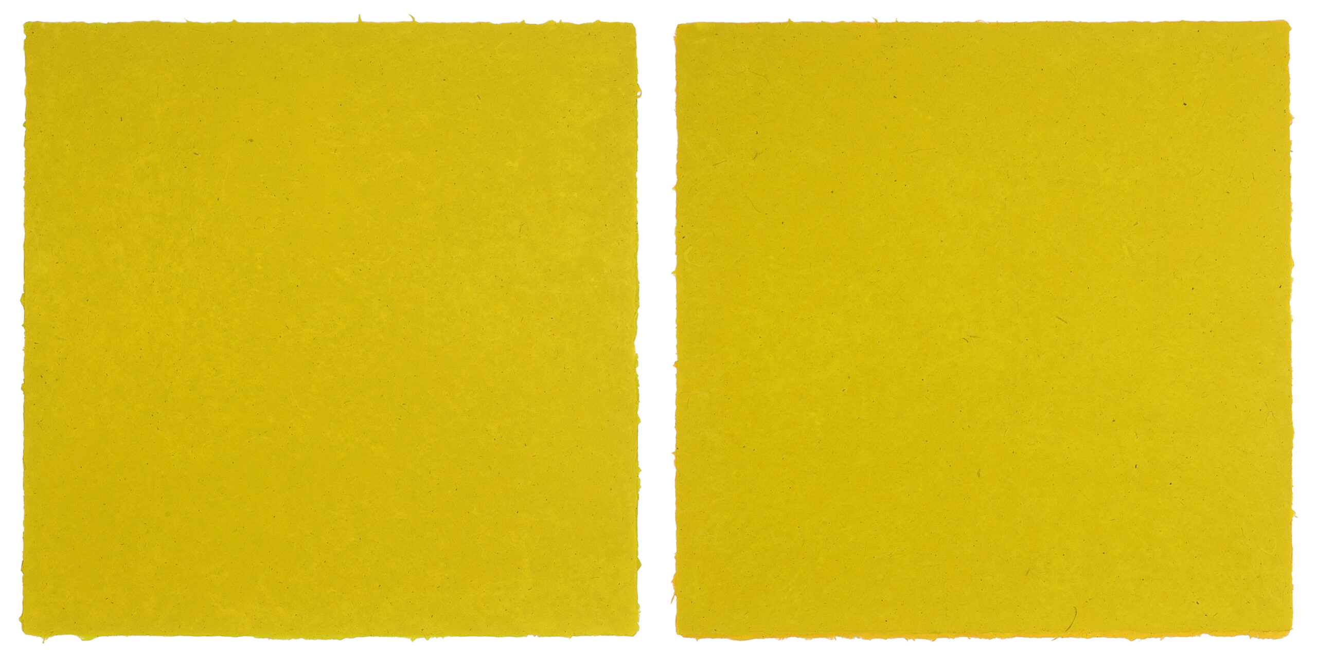
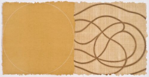
Red Green
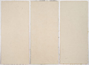
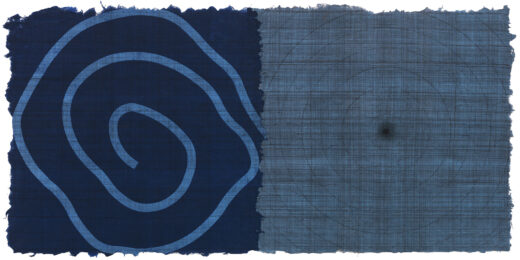
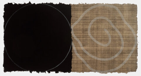
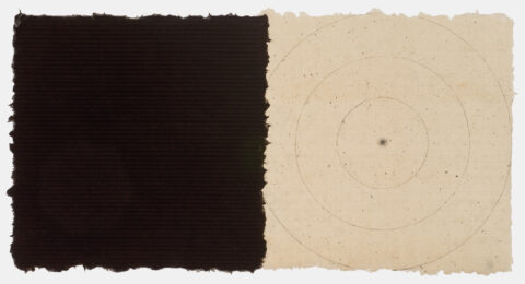
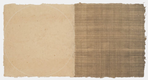
Relief on Four Sheets of Handmade Paper
48″h x 98.5″w Overall 2008
$12,000
SLOW ART
By David Bonetti
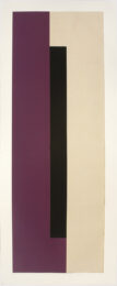
Anne Appleby’s work, her paintings and her prints, take time. We are so used to looking on the run, at wanting to be able to get the whole thing at a glance, that we’ve lost the skill of looking to see. Sure, we can see Appleby’s work at that quick, superficial level, too. The expanse of saturated color and the corona of a different hue along its edge, either painted on the surface, the two colors feathered into each other, or, as in the prints she made with Maryanne Simmons at Wildwood Press, the result of two layered sheets of paper, the bottom one peeking out beneath the top. Gorgeous, in either case. But there’s more to
Appleby’s work than that. And sometimes it takes a while to see it.
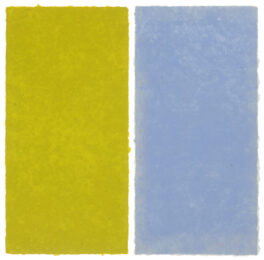
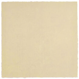
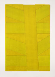
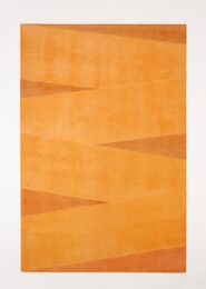
In the work on handmade paper from Wildwood Press, Appleby made a diptych of two large square panels titled “Red/Green.” The work is beautiful, but there’s a problem – both panels are yellow, a saturated saffron yellow.
The discrepancy between the title and its apparent color nagged at me. I looked but I didn’t see.
Appleby’s work seems to be abstract, non-objective, not referring to anything outside itself. It appears to be about nothing except its color, surface, expanse and edge. But, in fact, her work is based on colors in nature – the color of a budding branch in spring, of an autumn leaf, of the thick bark of an old tree in winter, of stone, of mulberry, of sweet pea. Maryanne Simmons thought that “Red/Green” was a pure color study, which would be, in my experience, something new for the artist. (It turned out not to be, to be after all based on color prompted by nature.)
“But what about the fact that the piece is called ‘Red/Green’ and both panels are yellow?” I asked kind of plaintively.
Maryanne explained that red and green inks were mixed in with the yellow. Almost immediately, I began to see the difference. In one panel, red tones became visible among the yellow, and in the other, green. I would probably have been able to perceive it on my own if I had not been impatient, but I wanted a fast answer, preferring a verbal explanation rather than an optical experience. I learned my lesson. I slowed down. From that moment on, I looked with greater concentration, with greater presence. And the more I slowed down, the more I saw.
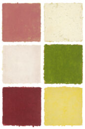
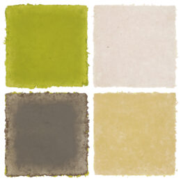
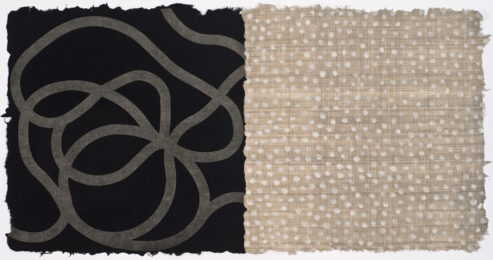
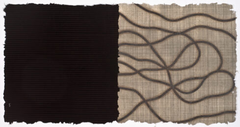
In the work made at Wildwood Press, there is infinite variety, and it is a pleasure to explore each sheet for its distinctive characteristics. Although the five prints20Appleby made, one with six double panels, are being editioned, no two will be exactly alike, as you would expect from a well-made etching or lithograph.
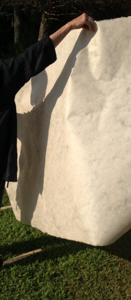
The handmade paper is roughly textured and each sheet takes the ink differently. The edges of each sheet have distinct contours, some more irregular than others. Commercially manufactured paper is so uniform you can forget that it is made from organic matter. The handmade paper Wildwood Press makes reveals its nature without subterfuge or shame. It is what it is – paper, made from wood, which comes from trees. It is beautiful but it is not refined. The fact that the handmade paper is so obviously a natural product makes it a perfect match for Appleby, whose project is distilling the colors of nature. The paper is the ideal support for her investigations.
David Bonetti (b.1947, d. 2018) was visual arts critic for the St. Louis Post-Dispatch. He had been art critic for the San Francisco Examiner and the Boston Phoenix.
