Roy Lichtenstein’s Imperfects at Gemini G.E.L. at Joni Moisant Weyl
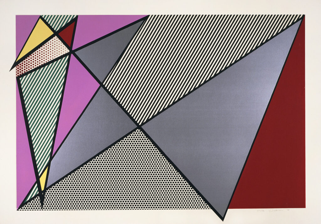
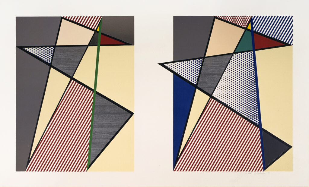
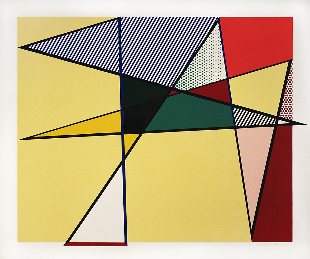
Between 1986 and 1988 Lichtenstein worked on a group of paintings known as the “Imperfects” – geometric abstractions of eccentric shape, some of which pierce the borders of the picture’s edges. In late 1986 work began on the Imperfect Print for B.A.M. (cat. no. 218), and shortly thereafter in February 1987, this print series was begun at Gemini G.E.L. Each of the printed images actually does break out of the border, extending at one or more points into the surrounding margins.
Imperfect 63 3/8″ x 88 7/8″, 1988, Roy Lichtenstein
The “Imperfect” series, printed on 4-ply Museum Board, combines woodcut and screenprint and all but one print have metalized Mylar collage elements. Lichtenstein sent the black-line drawings for the prints to Gemini G.E.L. in advance of his arrival, but worked out the colors there.
Imperfect Diptych 57 7/8″ x 93 3/4″, 1988, Roy Lichtenstein
For the woodcut portions Lichtenstein cut the outline (key block), and the large flat areas were printed separately from jigsaw cutout sections. To get the dense colors, several overprintings were required. The silver and galvanized Mylar were prepared in sheets and then hand-cut for each of the collage elements. The silver Mylar was overprinted with a clear coat to protect the reflective surface. The galvanized Mylar was overprinted with a silver run made from a rubbing of galvanized steel. A screenprinted coating has been applied to the verso of each of the boards to stabilize it.”
From Roy Lichtenstein’s print catalogue raisonne.
Imperfect 67″ x 79 7/8″ x 93 3/4″, 1988, Roy Lichtenstein
“Lichtenstein likes nothing better than rescuing discarded items from the trash can of history. That was one of the function of the Art Deco paintings and sculptures of the late sixties. Twenty years later he returned to the same theme, this time indirectly. People have largely forgotten the intense debates of the period, but at the same time Lichtenstein’s Modern works, as they were called, were often compared to Frank Stella’s Protractor series.
What struck critics then was the near simultaneity of these two returns to Art Deco, one emphatically parodic, the other, coming only a few months later, emphatically serious. Was it only pseudo morphism? The critical camps had been pretty divided until then, with the notoriously anti-Pop Clement Greenberg at the helm. But the highbrow mapping of styles that had dominated art talk for more than a decade suddenly began to look suspect. The look-alike is a deadly weapon: pretty soon Kenneth Noland’s Circles and Jasper Johns’ Targets were put on the same side of the ledger, and well-established aesthetic criteria quickly crumbled. The Perfect/Imperfect paintings rewind us back to this era of ardent polemics, and, somewhat solipsistically, to the critical reception of the Art Deco paintings.”
Yves Alain Bois, professor emeritus of Art History at the School of Historical Studies at the Institute for Advanced Study in Princeton.